LinkedIn users recently woke up to an entirely revamped desktop design — the biggest overhaul the social media platform has ever carried out since 2003!
This latest design change reminds many of another, well-known social media platform… The new interface is currently being rolled out globally. Are you already on the new version?
You probably noticed that LinkedIn modified its mobile app in December 2015, making it much more user-friendly. Changes to LinkedIn’s mobile app design helped the company increase daily use by 30%, user engagement, by 40% and the number of messages sent, by 240%.
Geared Towards Mobile Users
LinkedIn’s goal is to generate similar results by creating a desktop experience similar to its mobile experience. With over 467 million users, LinkedIn is vying on boosting its number of active users.
LinkedIn’s new interface is simpler and more intuitive: it flows much more seamlessly. For the moment, no features are linked to Microsoft; however, it’s only a matter time, considering that Microsoft acquired LinkedIn in 2016.
So what are the changes to LinkedIn’s new design? The biggest revamp is its homepage. As soon as you sign in, you’ll quickly notice the difference. At first, you may find it difficult to find the features you’ve grown accustomed to. To help, here is an overview of the major changes to LinkedIn’s interface: a new menu, real-time messaging, intuitive search tool and improved newsfeed.
New menu
LinkedIn’s menu now features seven components: the search bar and the tabs “Home,” “My Network,” “Jobs,” “Messaging,” “Notifications,” and “Me.” The latter tab offers shortcuts and settings for your specific account.
You can also click on “Work” to explore other LinkedIn products (advertising options, LinkedIn Learning, post a job offer, groups, ProFinder, Lookup and Slideshare) as well as other professional solutions (Talent Solutions, Sales Solutions, Learning Solutions).

The way you use LinkedIn remains the same and many features are looking more like those found on Facebook. Rather than starting from scratch, LinkedIn was inspired by the most popular social media platforms out there, making the browsing experience much easier for users.
On LinkedIn, you can share content, follow and unfollow people and even hide posts. Just like Facebook, LinkedIn shares trending posts from its users, LinkedIn editors, and even based on proprietary algorithms.
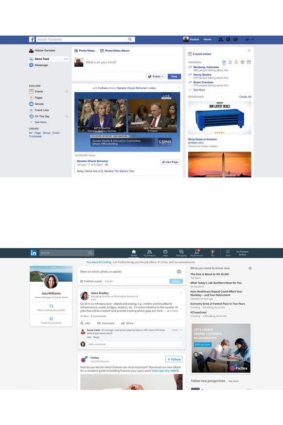
LinkedIn’s user experience has been optimized for the needs of its users: communicating with contacts and leveraging their networks to create business opportunities.
Real-time messaging
Do you send a lot of messages on LinkedIn? In the past, did you find that its messaging feature was less than stellar? Until now, you had to go through the private messaging feature to send a message to another user. This meant you couldn’t simultaneously consult a LinkedIn profile or browse elsewhere through LinkedIn.
Now, LinkedIn’ messaging service features real-time messaging. Again, the similarities with Facebook are truly stunning. LinkedIn’s new real-time messaging means faster, simpler and more accessible discussions between users.
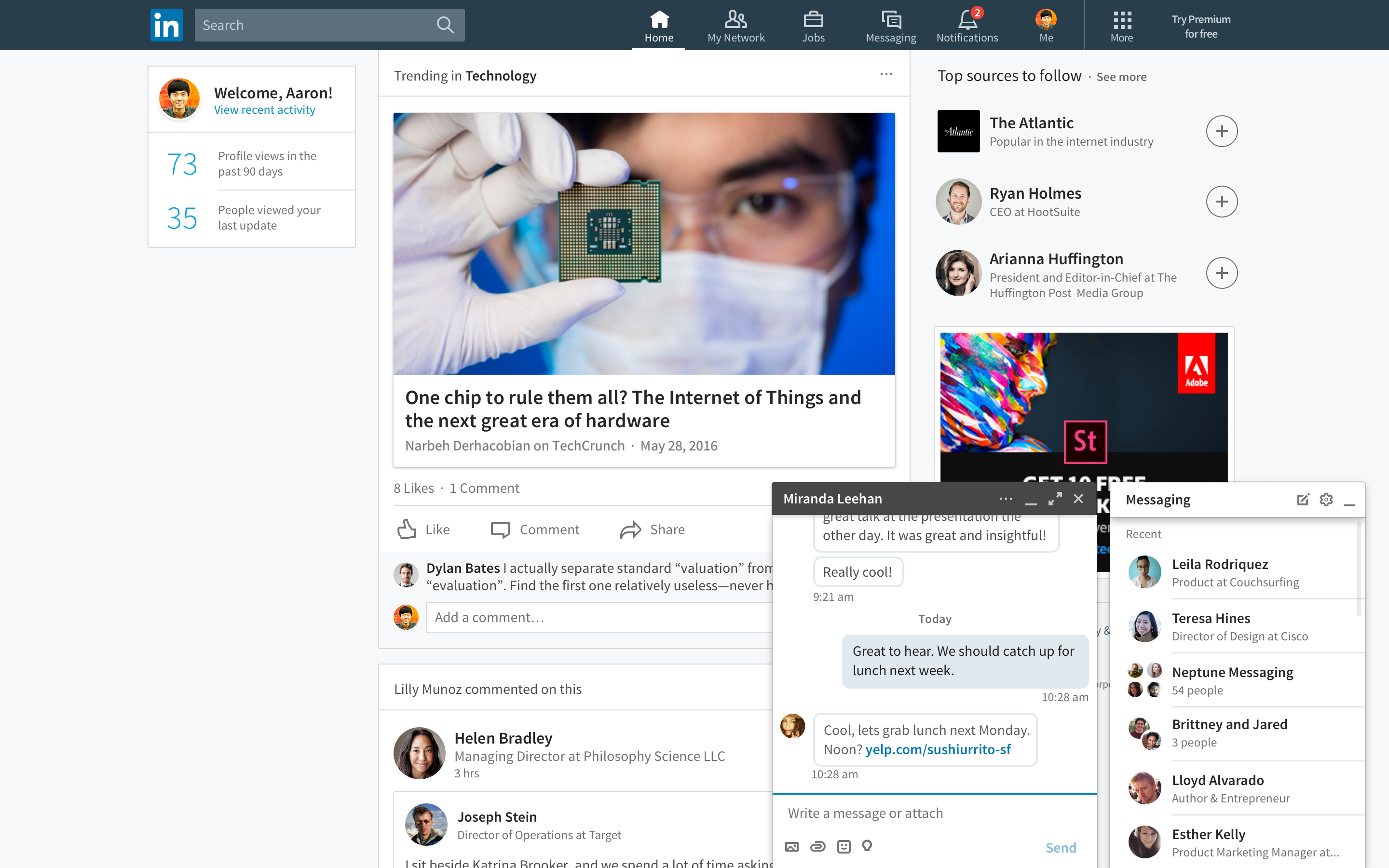
LinkedIn will also suggest other ways you can break the ice and start a conversation with someone. These suggestions will become more and more relevant as you drum up business opportunities.
Modified search tool
LinkedIn’s new interface features a search tool that enables you to quickly find people, jobs, companies, groups and educational institutions. What’s more: you can carry out your searches using filters, including the degree of connection, location, current employer, former employer, activity sector, profile language, interests, and schools attended.
If you want to fine tune your search with additional criteria, you must use LinkedIn’s Premium version.
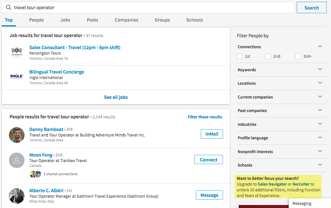
Although LinkedIn’s search capabilities have been modified, they nevertheless resemble what was available in prior versions. When the latest version of LinkedIn was launched in January, many people had the impression that the advanced search options were no longer available. However, this is not the case.
Improved newsfeed
LinkedIn’s new website also features an improved newsfeed. Based on a combination of algorithms and content creators, the newsfeed is now more customized to suit your areas of interest and topics you enjoy.
Therefore, LinkedIn recommends organic and paid content that is relevant to you.
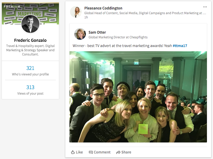
LinkedIn’s revamped interface puts conversations and content at the heart of the platform, which means you can more easily share ideas, participate in discussions, and discover topics and news items that interest you.
There is a catch: if you want to personalize your content and receive certain type of posts, access to Pulse and other interest categories has disappeared. But don’t despair! You can still access the old version of LinkedIn by clicking on this link.
To answer the burning question I am sure a lot of you have, I’ve got to admit that I am not a huge fan of the new design. LinkedIn basically replicated its mobile version, which represents 70% of its traffic, on desktop. Logical? Yes. But LinkedIn will have to do a better job to communicate changes to its users.
Many sense that LinkedIn is facing mounting pressure by Microsoft to monetize its use, inciting people to pay for Premium access, for example, in order to access features that used to be free.
What do you think of LinkedIn’s new interface? Do you think the design will create enough buzz and engagement to increase the number of active users? And increase time spent on the platform?




Leave a Reply