Do you invest in ad campaigns to promote your products or services? Do you send leads and clients to your home page or specific sections on your website when you carry out promotions?
Although these are good strategies to drive traffic, simply sending them to your website will not necessarily mean you’ll generate any conversions.
A conversion is defined by a website visitor or recipient of a marketing campaign that completes a desired goal, such as purchasing a product, filling out a form, downloading a document, or having a specific behaviour on your site, i.e. spending at least two minutes, or visiting at least three pages per session. Conversions can also take place offline; for example, a potential customer could call your company or visit your store.
One of your website’s main goals is to promote your business and various products and services to visitors. However, it was not necessarily designed to meet the precise needs of each ad campaign you deploy.
That is why it is crucial to create landing pages in order to promote and hone in on a specific offer.
Did you know that 48% of marketers create a new landing page for each ad campaign? It’s now your turn to create your very own landing pages or optimize those that you already have!
What is a landing page?
A dedicated landing page is a page that is usually independent from your website and does not appear in your site map. It is therefore a unique and hidden page where visitors end up after having clicked on a PPC ad, Facebook post or newsletter, for example.
A landing page’s goal is to get a visitor to perform a specific action that leads to a conversion, such as provide contact information to sign up for something, buy a product, download or register for content, or request a quote for a service.
Landing pages are great marketing tools that help to generate conversions or gather useful information on your customers.
Why is it important to create landing pages?
Did you know that offering targeted, relevant and detailed information on one page can increase your conversion rate by 55%? In reality, landing pages always achieve better results than a website. Why? A website presents a variety of different information and promotes a business or brand.
However, a landing page has only one goal and showcases only one specific product or service. In addition, with a website, visitors can browse through all of its sections. On the other hand, with landing pages, visitors can only perform one action and click only on one button or link.
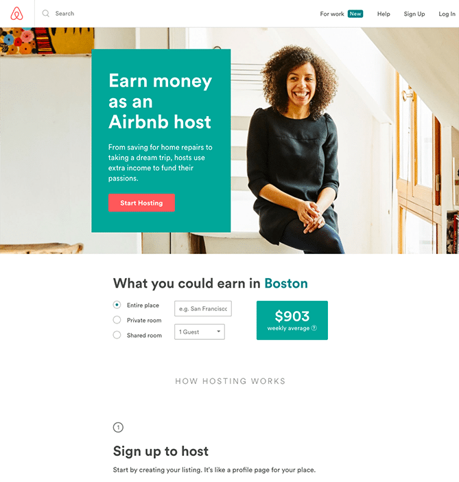
Ideally, you should create a landing page for each online ad campaign you have.
What are the essential elements of a landing page?
What is the best way to create a landing page for an ad campaign? First of all, remember that while each landing page must be different, the ultimate goal of all your landing pages is to generate clicks or leads.
Before you start to design your landing page, ask yourself the following questions:
- What is my objective? What do I want my visitors to do?
- What does my business specifically offer? Why is it interesting for consumers? What are the advantages of my products and services?
- Why should visitors take advantage of my offer now as opposed to in the future?
- What is the registration, sign up or reservation process? Is it easy for visitors to perform the action I am requiring of them?
A landing page must be very simple! The page’s structure must be sleek, and the design must not distract visitors.
By asking yourself the questions above, you will be able to better structure your content and address the most important parts of your landing page.
The unique selling proposition (USP)
Start by identifying your unique selling proposition (USP). What differentiates your products or service from competitors? What value do you bring to the table? What are the perceived benefits or anticipated results of using your products or services?
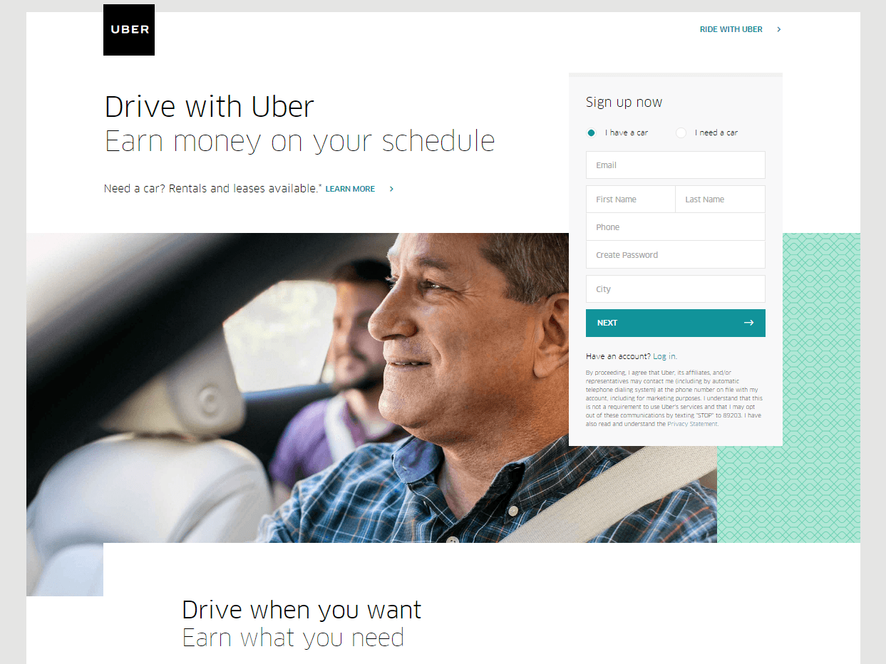
The headline and sub-headline of your landing page are very important. They must be compelling and quickly draw attention to your unique selling proposition.
You should also describe the benefits of your products or service and include testimonials from existing customers in order to establish trust and facilitate conversions. Your landing pages must be clear and provide all the most important information. Remember: keep it simple and effective.
The call to action (CTA)
In order to optimize your chances for the highest conversion rates possible and ensure that your visitors have no other choice but to perform the desired action, use only one call to action (CTA). Because your landing page only has one goal, which is triggering a conversion or lead, don’t offer visitors too many links to click on or information to read.
Choose the most important action and highlight it using a button that visitors must click. Your CTA must be very clear and not confusing.
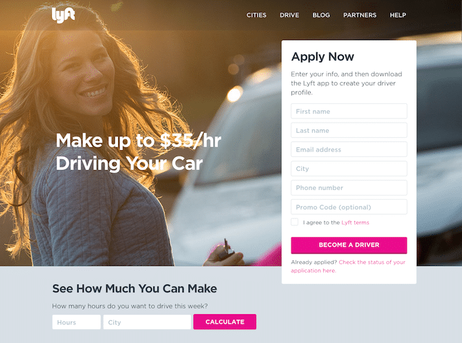
While the above landing page example does a great job of communication the USP – make more money driving your car – the co-existence of two call-to-actions on the same page could be a deterrent and lead to inefficiencies.
Also, if you include a form on your landing page, don’t require that visitors enter too much information from the get-go. This could dissuade visitors carrying out the desired action.
Landing page design
Although your landing pages are not a part of your website, make sure you nevertheless use the colors, fonts and overall imagery of your brand. What’s more: make sure your landing pages are mobile-friendly (aka: responsive) as many visitors will be using their mobile devices as they click on one of your ads.
Opt for a simple and sharp landing page design. Don’t crowd it with too much text or images. Your landing page should be easy to read and guide visitors to your CTA as quickly as possible.
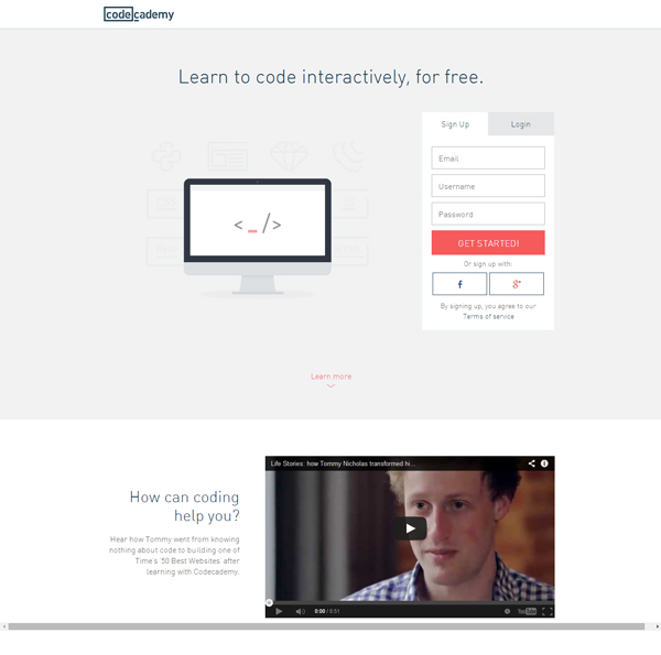
Did you know that using videos can increase conversion rates by 86%? Adding a video on your landing page is a great idea; however, make sure you don’t muddy the design with too mages images.
With any landing page, keep the navigation simple and focus your efforts on the CTA. Identify one goal for each landing page and concentrate on finding means to encourage visitors to perform only one action.







Leave a Reply