We often hear people talk about terms, such as mobile-first and responsive—only to scratch our head as to what they really mean. Want to make sure you follow trends without getting caught up in the hype? Let’s start by demystifying these buzzwords in order to gain clarity and determine if a mobile-first strategy is right for your brand.
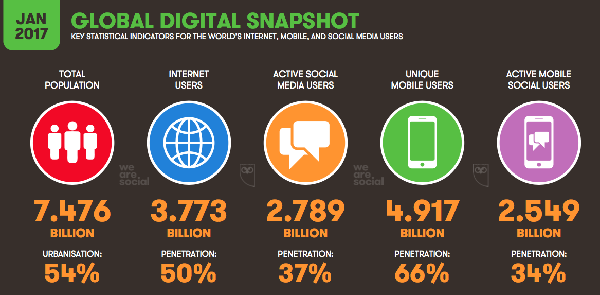
The web is a vastly different landscape than what it once was. Did you know that 68 million Google searches are carried out on mobile devices every hour around the globe? What’s more: 69% of travellers start their online searches on a mobile device!
In fact, mobile bookings in the travel industry grew by 1700% between 2011 and 2015, moving from 1% to 18% of online revenues. Now imagine how those numbers have skyrocketed in 2017! I was recently conducting a website audit for a ski resort, and we found that 65% of their website traffic was now coming from mobile devices!
Mobile users are a force to be reckoned with—and it’s a reality marketers must deal with in order to ensure long-term success.
What is responsive design?
The term responsive web design, first coined by Ethan Marcote in 2010, describes a technique in which a website’s design is automatically adjusted based on the size of users’ screens. Thanks to responsive design, users can easily browse a website regardless of what device they use.
The site’s layout and content will change based on the width of a browser on a device. Quick tip: You can determine whether or not a website is responsive by manually zooming in and out of the browser window.
Responsive design means that you only need one website. The design, content, and user interface of your website is adapted so that visitors can seamlessly visit it on any device and any browser.
You no longer have to create two versions of a website—one for desktop computers and one for mobile devices. You can always tell if a website has been designed for mobile devices with the URL that starts with a “m,” such as m.facebook.com.
What is an adaptive website?
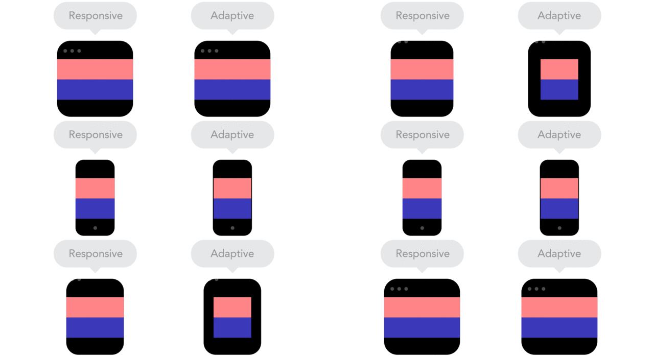
When a website features a responsive design, it means it will adapt to the width of users’ screens, allowing for maximum versatility. If a website is adaptive, it will adapt to specific screen widths of desktop computers, tablets or smartphones.
Devices all have set browser widths that are widely known and enable developers to develop websites that will adhere to their specifications.
Responsive vs adaptive websites:

Creating an entirely responsive website takes time because it must optimally adapt to the width of every browser. Note that the terms “responsive” and “adaptive” are often confusingly interchanged; oftentimes, developers create websites that are both responsive and adaptive.
However, several websites may seem responsive—but are not; they may actually be a blend of both techniques.
What is mobile-first design?
When you first create or re-create your website, you don’t have to choose between a mobile-first or responsive design. Instead, the former is actually a design strategy (mobile-first), while the latter is the result of a technical approach (responsive).
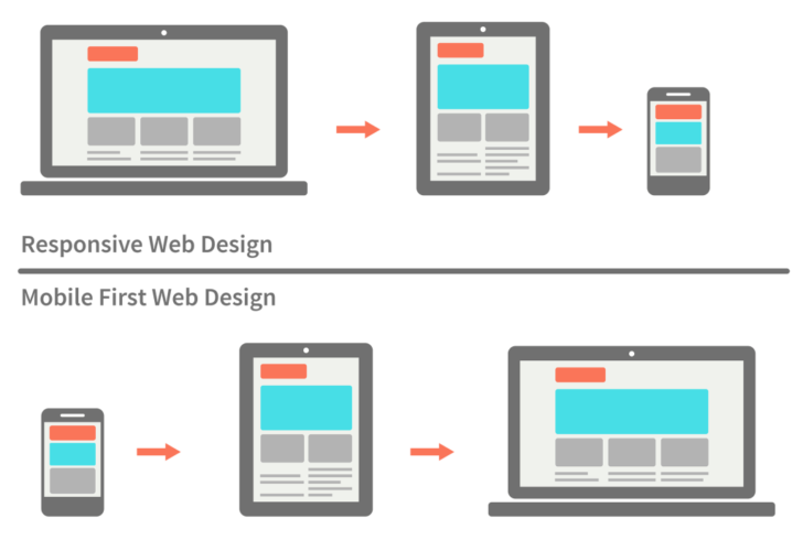
If a business develops its website, the design is often based on the assumption that visitors will browse it on a desktop computer. Then, the website is modified to adapt to different devices, including smartphones and tablets. In other words, the site is scaled down; this approach is widely known as graceful degradation or desktop-first.
Unfortunately, many visual aspects and features of a website are optimized for desktop computers—but adapt poorly to mobile devices. This is when designers adapt a new approach called progressive enhancement or a mobile-first strategy.
By doing so, they initially design a website for the smallest mobile devices possible and then scale upwards to adapt to desktop computers.
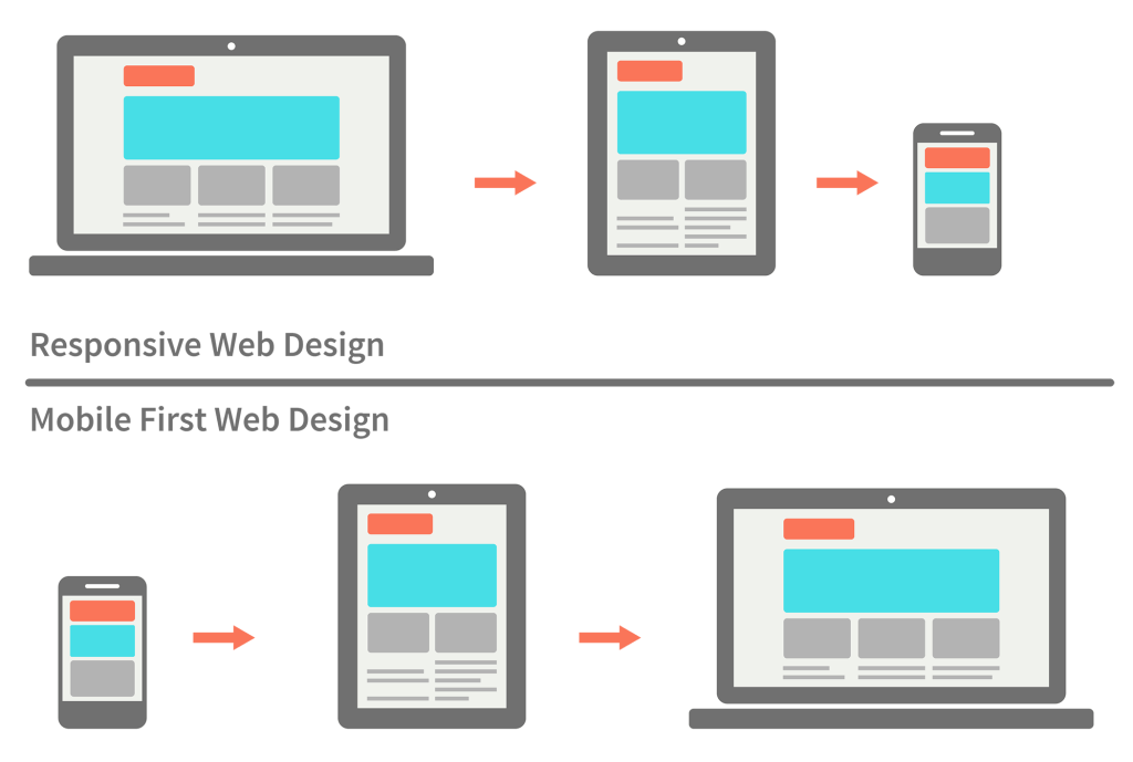
Initially introduced in 2009 by Luke Wroblewski, the mobile-first concept purports that the mobile version of a website should be at the heart of the design strategy and take into account the constraints and user browsing behaviour on mobile devices.
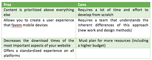
Because adopting a mobile-first strategy is quite different from a desktop development approach, it can be challenging for teams who are used to designing for browsing on computers. When you embark on a mobile-first strategy, your website’s content must be carefully analyzed and structured to categorize it based on importance and ensure that the overall design remains refined.
Additional layers of content can then be added for visitors who browse using larger screens.
Is a mobile-first strategy right for me?
A mobile-first strategy can be immensely successful; however, it has not been adopted by all web agencies and it’s not right for every business. It can be extremely expensive and may not generate the results you’re looking for.
Many companies prefer investing in a website that is adapted for desktop computers and ensuring that mobile users can quickly easily find the information that they are looking for.
So how do you know if you really need to create a mobile-first website? Start by learning more about your website visitors and creating personas based on your most important customer segments and overall business goals; after all, you know more than anyone else who you are trying to target and what you need to achieve.
It depends on your clientele
The ideal solution will depend on your clientele, what devices it uses and your budget.
Here are some questions you need to ask yourself:
- Do my customers prefer searching the web on computers or mobile devices?
- Does my clientele mainly use mobile devices to browse the web?
If the answers to these two questions is geared towards mobile devices, then you know that you should opt for a mobile-first strategy. If not, then a mobile-first strategy is not necessarily right for you.
Should your target customers use mobile devices, but don’t visit your current website with them, you will want to ask yourself a few more questions:
- Why do your customers avoid visiting your website with their mobile devices?
- Is it simply out of habit or because your website does not offer an appealing or intuitive browsing experience?
- Would more customers visit your website with a mobile device if the interface was adaptive or responsive?
If you are unsure of the answers to these questions, you may have to experiment.
Remember that from the get-go, visitors will not initially distinguish between a responsive, adaptive or mobile-first website. What’s important for visitors is the ability to quickly and easily find the information they need—and perform the actions they’ve set out to do.
In fact, when designing a website, I like to think that we should all adopt a consumer-first strategy. That’s really what it all boils down to… assuming you know who your target consumer is, or course! 🙂




Leave a Reply