While it has become increasingly difficult to organically reach users on Facebook through regular (organic) posts, there is no denying users are more active and spend more time on the platform.
Just check out these recent stats showing that 66% of total users – yes, that whopping 2 billion plus – are now active on a daily basis. That’s right. Active. Every. Day.
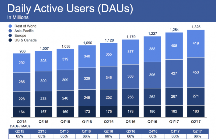
It should be noted that back in 2011, it was 56% of total users that were active daily, which means this proportion has increased steadily in time, in great part with the shift happening to mobile usage.
Interested in this topic? Check out our webinar Best practices for Facebook Ad campaigns
In fact, Facebook now estimates that 61% of its users come to Facebook ONLY via mobile devices. Food for thought for both organic and paid content travel brands are publishing on the popular social media, wouldn’t you say?
The Ad Campaign Structure
When it comes to building an ad campaign through Facebook’ native Ads Manager tool, it’s good to remember the basic structure at its core:
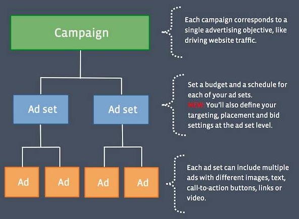
There are essentially three key steps to building an effective ad campaign within Facebook, as summarized in the image above. Here are four tips to make sure you will get the most effective design – and results – for your next ad campaign:
1. Define Your Objective
Before you delve into the design of your publication, you need to first define what goal you are seeking. More visibility? More reach? Generating traffic to your website or foot traffic to your property? Getting more views for a video? Having more people fill a lead generation form?
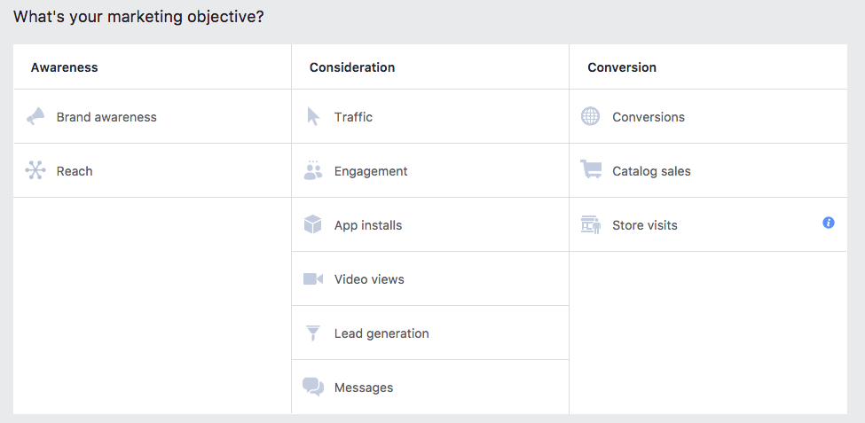
You won’t tailor the style and format the same way depending on the objective, as inspirational images might work better for awareness campaigns while a compelling drive to action is required if you want users to click an offer and convert.
2. Use Quality Images
Great images tell a story, so there is no reason to settle for low quality pictures or out-of-focus shots. Not sure what dimension works best in the Facebook newsfeed versus Instagram newsfeed, or if you should focus on mobile versus desktop?
Check out the Facebook Ads Guide for all the details
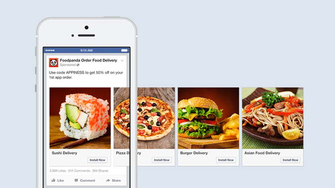
If you crop your image but still want to insert too much information, consider using carousel format where you can feature many images in a single ad, each pointing to a different URL if you so choose.
3. Show People Using Your Product or Service
On some social media such as Pinterest, it has been proven that showing people, specially faces, can impact negatively the level of clicks and repins for images. Such is not the case with Facebook, on the contrary.

Facebook ads often run in a user’s newsfeed or Instagram feed, alongside posts from colleagues, family and friends.
To create attention-grabbing ads that feel like a familiar part of someone’s social fabric, show images of folks enjoying your service or product, instead of just the product itself. We’re selling travel experiences, after all…
4. Less Is More
Last but not least, the “less is more” principle truly applies to Facebook ads, in particular when it comes to text! Facebook penalizes posts and ads where the image has more than 20% of text.
The reason is simple: text tends to clutter users’ newsfeed and distract them, so Facebook will show them less. Read also: Facebook policy on using text in ads
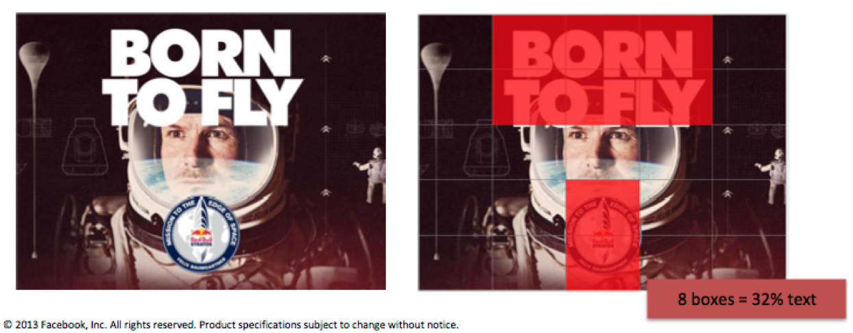
Less is more also means keeping it short when it comes to the title and description that come alongside your main image. You are running videos? The shorter the better as well, in general (there are exceptions, as always).
You want to run a carousel format? You can feature up to 10 images… but if you have only 5-6 quality pictures, don’t stretch it.




Leave a Reply