Well, I had been hearing about “it” for the past week in various blog posts and tweets, and so I was excited to receive an email from Twitter finally telling me I could now access the new profile designs. The very first thing that springs to mind is: “Wow, this profile page is just like Facebook!”.
These new profiles are now available to everyone, at least the desktop version. No news as to when the mobile version will be available, but since 84% of active users access Twitter from their mobile devices, we can expect it soon.
Below is a screenshot of my Twitter profile page BEFORE the change:
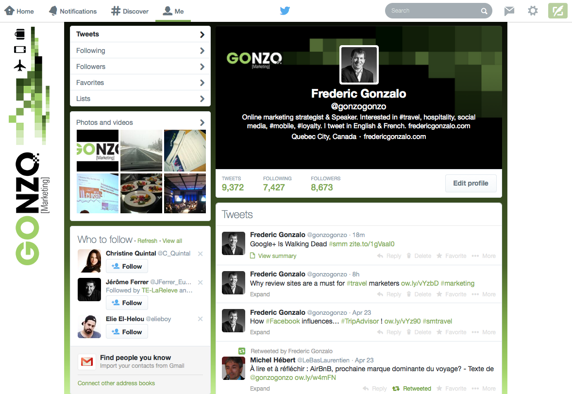
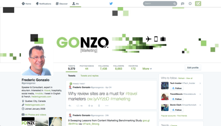
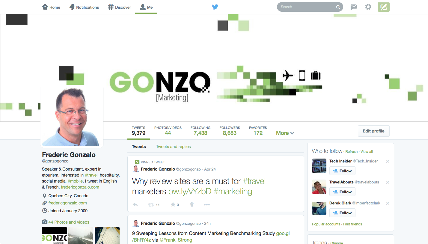
And here is a screenshot of what my new Twitter profile NOW looks like:
Pretty dramatic change, right? Here are five tips to keep in mind when updating your profile and managing it moving forward, both for personal and brand accounts alike.
1. Profile photo
While your present picture will be automatically resized to fit the new dimensions, why not take this opportunity to change your profile picture with a more recent one? The dimensions used to be 256 x 256 pixels, but bear in mind the new ones are 400 x 400 pixels, so make the most of it.
2. Cover photo
This feature is without a doubt the biggest visual change, and the biggest “steal” from the Facebook playbook. The cover photo was never a key component of your Twitter profile, but you can now showcase your brand much more prominently.
The dimensions for the new cover photo space are 1500 x 500 pixels. It will be interesting to see if and when brands start inserting call-to-actions here or promotional messages.
3. Photos / Videos
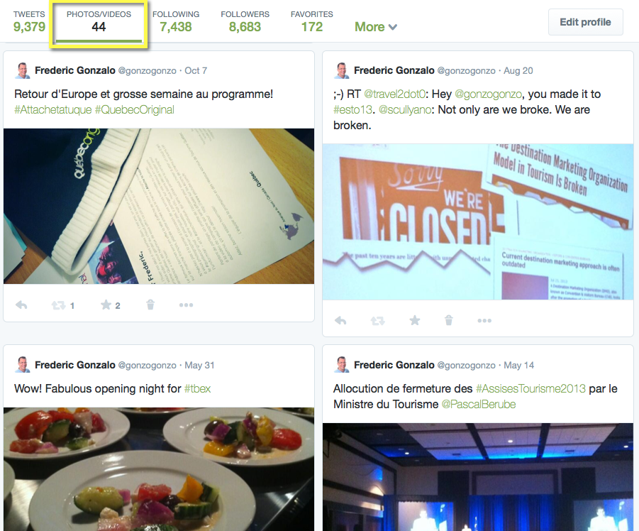
We all know how much photos and videos are becoming de rigueur in social media, as most shared items across all platforms. Twitter is taking steps to ensure photos and videos will also become more central to its platform, and you’ll notice how the tweets, following, followers, photos/videos, and favorites tabs are now right under the cover photo, making them easier to access. And share! Notice also the bigger rectangles and font, making the overall look & feel more dynamic.
4. Favorites
While the ‘Favorites’ tab was always available in the old profile page, it was on the left hand-side, at the bottom of the list. It now shows prominently on the main navigation bar under the cover photo, as shown above. More importantly, it now highlights how many favorites you or your brand account has.
This can represent an opportunity for brands to ‘favorite’ whenever influencers or traditional media retweet or mention your brand, for example.
NOTE: Many folks, myself included, used to favorite tweets as archiving mechanism, so you could go back and read tweets later on. I never realized I had 172 favorites until today! Might be good timing to revisit if all ‘favorite’ tweets really deserve to be there, in broad daylight…
5. Pinned Tweet
This is another notorious ‘steal’ from the Facebook playbook, yet it may prove to be one of the most interesting new features on Twitter. You can basically decide to feature any given tweet, by pinning it at the top of your profile, ensuring more visibility even if (or in particular when) it’s an older tweet.
Brands will want to focus on important tweets, promotions or PR-driven messages, specially if they have a promoted account campaign on Twitter, when new users may discover their page. Incidentally, after less than 48 hours of having a pinned tweet on my account I have already noticed more action (retweets) on it than since I initially tweeted it a few days ago!
It will be interesting to see if these changes have any effect on user uptake and engagement. Out of the one billion registered users on Twitter, latest stats report 261 million monthly active users, of which 184 million are mobile monthly active users. What do you think, will these changes have any impact?


Leave a Reply