I was recently invited to deliver two workshop sessions at NTA’s annual Contact event, which was being held for the very first time in my hometown of Québec City. How nice to speak at an international event… and then be able to sleep in my own bed at night! 🙂
My session on Right-Time Email Marketing provided quite a few interactions, so I thought I would share with you some of the useful tips that participants enjoyed the most or that I believe travel marketers should focus on when it comes to communicating by email in this day and age.
Tip 1: A/B Testing
Is there a best time to send out newsletters to your audience? Of course there is. Should you write a title such as “Exclusive Offer: 50% during a limited time” or perhaps “Deal of the century!” might suffice? You may wonder if you should insert a photo at the beginning of your email, or rather position it further down in order not to divert the reader’s attention…
The above scenarios don’t have any silver bullet answer, as things will vary per brand, per industry and per target audiences being reached by the email or newsletter. The key thing here is to test things out to see how your audience reacts to the above A or B scenarios.
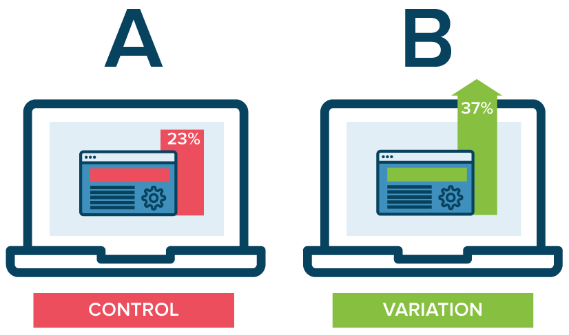
When using tools like MailChimp, you can decide to send two versions of an email to only 10% of your database, then see how users react, through open rates or click-through rates for example. Depending on the results after 24 hours, you can then send out the most impactful version to the remaining 90% of your database.
Simple enough, right? Indeed, yet it is estimated that less than 30% of email marketers actually test their content on a consistent basis!
Tip 2: Include photos and videos
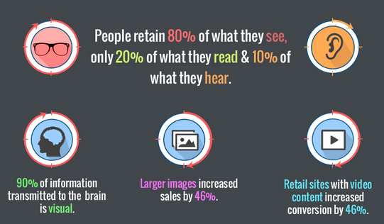
In a world where we have less and less attention span, and consumers are bombarded with ads and content on every device, we need to keep it simple and keep it short. Photos and videos thus work wonders when it comes to communicating promotional messages while providing quality storytelling.
Read also: Why Visual Content Drives Social Media Engagement
A word of caution, however. Many internet service providers (ISP) tend to block off images when it comes to newsletters, so make sure to insert detailed descriptions of images so that if they are blocked, at least users can see that it relates to “double king-size bed suites” or “image of Hotel XYZ Resort in Puerto Mexico”.
Users should also be able to read the content of the newsletter directly through a web browser in case content doesn’t load or is being blocked off.
Tip 3: Work the database
Unless you maintain your database, it will become obsolete within 4-5 years, since every year we tend to lose anywhere from 10-25% of qualified data. People move, change work or home email addresses, and so on.
It is thus important to have tools in place to make sure you track people who subscribe and unsubscribe, and more importantly that you have a strategy in place in order to acquire more qualified names into your database.
Tactics to increase your database include:
- Asking for name and email address when people check-in, or at your place of business
- Have a visible subscription button on your website homepage and every key page of your site
- Mention your newsletter content and subscription regularly on other digital outposts, i.e. social media accounts, emails to clients, etc.
- Have a pop-up on your website whenever users have spent at least one minute or have visited two pages or more
- Provide an incentive when subscribing, i.e. a 10% discount on your next reservation
- Include information related to your newsletter at the bottom on employee email signature
Tip 4: Think mobile
Since 2013, more than 50% of emails are now read on a mobile device. In fact, in 2016 this figure has now surpassed more than 63% and sometimes even more in specific segments such as luxury travel, and with specific demographics, such as Millenials (folks aged 18-35).
Read also: Why Millenials Matter
Because of the limitations due to smaller screens, we ought to think of content – text, photos, videos – in a more succinct manner, with clear call-to-actions such as click-to-call if you seek to generate conversions but your website may not be transactional or mobile optimized.
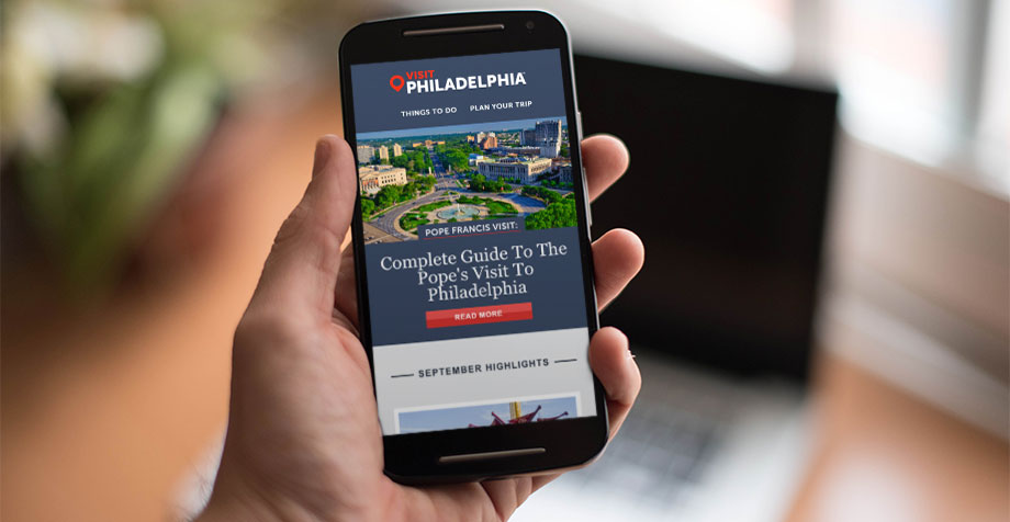
More concretely, you will want to make sure emails are optimized for mobile devices, which entails any of these tips:
- Use a single column template: If users have to zoom or scroll to read content, it makes navigation more complicated which ends up in sub-par experience.
- Have a call-to-action button: It’s always good practice to have only one main call-to-action per newsletter. When thinking mobile, make sure this CTA is easy to find and click with a button clearly stating its purpose.
- Avoid small fonts: This means, ideally 14pts or more for body text, and 22pts or more for headlines.
Tip 5: Write powerful titles
Do you have any idea what the ideal length for a newsletter or email title might be? If you read it on a desktop, that would be 50 characters or less. And on mobile devices? 20 characters or less!
You may also have heard that 70% of people share content on social media… without having even read it! Well, if you want to ride that wave, you will need to have a title that drive people to want to read and share your article. Something like “June newsletter” is simply not going to cut it…
Remember, 80% of users will delete an email within 3 seconds of reading it, so this almost always begins and ends with the title. Make sure you give me a compelling reason to open it and read on!
In case you would like to check out the slides I used for this workshop, here is the presentation on SlideShare:
And if you are interested in this topic, you may want to read also:
The Art of Crafting Powerful Newsletters
Handy Email Acquisition Tips For Travel Companies



Leave a Reply